From Data to Destination: A User-Centered Vision for Outdoor Recreation
This usability study evaluated the Pikes Peak Outdoor Partnership Initiative (OPPI) Data Hub, assessing both the live ArcGIS Hub and a high-fidelity Figma prototype with seven representative users. Our research revealed a significant disconnect between the Data Hub's data-centric presentation and the expectations of recreational users, leading to four prioritized recommendations to transform the hub into an accessible, user-friendly resource.
Understanding the economic landscape shaping user expectations
U.S. outdoor recreation economic output
(2023)Colorado residents participating in outdoor recreation annually
Colorado's outdoor recreation industry GDP
The outdoor recreation sector is a powerful economic force, but users come with high expectations set by mature platforms like AllTrails, Gaia GPS, and Komoot. The PPORA Data Hub must meet these foundational expectations to become an indispensable community resource.
We developed three distinct personas representing key audiences for the PPORA Data Hub, each highlighting unique goals, motivations, and needs.
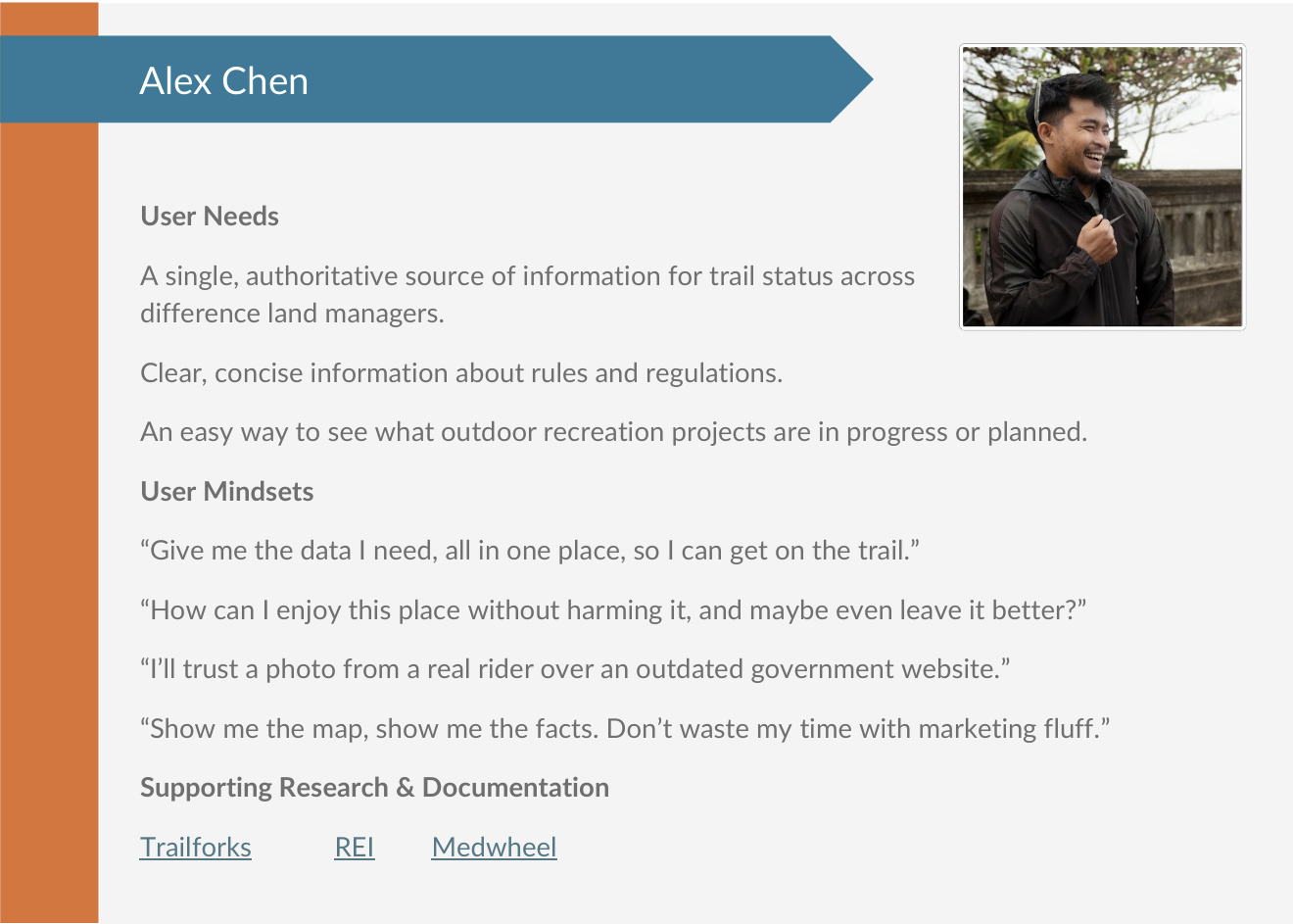
Outdoor Enthusiast
34-year-old GIS analyst and avid mountain biker who values reliable trail information and environmental stewardship. Seeks efficient planning tools and volunteer opportunities.
Business Owner & Stakeholder
40-year-old mountain biking company owner who needs dependable trail data for his business and customers. Volunteers with local trail organizations.
Community Planner & Advocate
57-year-old fitness coach with nonprofit management background. Seeks regional recreation data for community engagement and sustainable development.
We constructed a journey map centered on our primary persona, Alex Chen, illustrating his actions, thoughts, and emotional state across four key stages. The map reveals a significant emotional decline from initial curiosity to frustration during the research and planning phase.
Alex Chen's Journey: From Discovery to Post-Activity Reflection
Data-heavy, professional focus clashes with recreational planning goals
Lacks essential details like trail difficulty, length, and current conditions
Confusing structure without intuitive search or filtering tools
Moderated remote usability tests with seven participants in September and October 2025. Participants completed four core scenarios on both the live ArcGIS Hub and Figma prototype.
Using the "See, Say, Do" framework to analyze user behavior patterns
Users hesitated on homepage, scrolling without clicking. Many ignored map-based links.
"It seems very data-heavy from more of a professional side, not a consumer side."
Mismatch led to confusion and immediate disengagement.
Users went directly to search bar, typed "Garden of the Gods," received "No results found."
"The lack of somewhere to search is throwing me off a lot."
Nearly all participants failed to find "easy" trails due to missing filters.
Users clicked trails revealing pop-ups with technical data (e.g., "Activity_C," "Buffer Dist").
"It's written like a back end instead of a front end, you know?"
Unable to complete tasks without key information like difficulty and length.
Users overwhelmed by layers and colors. Zooming didn't clarify information.
"It just looks like a lot of shapes and colors to me, so I don't know where to even start."
Struggled with map layers and legend, clicking aimlessly without achieving goals.
Redesign the homepage to be task-oriented and visually engaging for the general public. Replace data-centric layout with clear calls-to-action like "Find a Trail," "Explore Parks," or "Plan Your Adventure."
Add a large, persistent search bar at the top of the homepage and all subsequent pages. This search should query all site content, including parks, trail names, and key locations.
Display simple, visually appealing pop-up "cards" containing critical information: trail name, difficulty, distance, estimated time, elevation gain, and allowed activities.
Redesign the map interface with simple, always-visible filtering tools. Allow users to filter trails by difficulty, distance, and activities. Ensure the map legend is clear and concise.
By implementing these user-centric recommendations, PPORA can transform the Data Hub from a complex data repository into an indispensable, accessible, and highly-utilized resource for the Pikes Peak community and its visitors.
Conducted comprehensive research with diverse user base
Analyzed qualitative and quantitative data to identify patterns
Prioritized solutions addressing high-severity usability issues